
Last updated:
May 23, 2026
How to style Dynamic Map elements and states
Elements not listed here can be styled as default Webflow elements.
Pin States [Hover + Active]
Add via Extra Elements if deleted before. The map location pin can be styled in Webflow Dynamic Map's Style Guide.
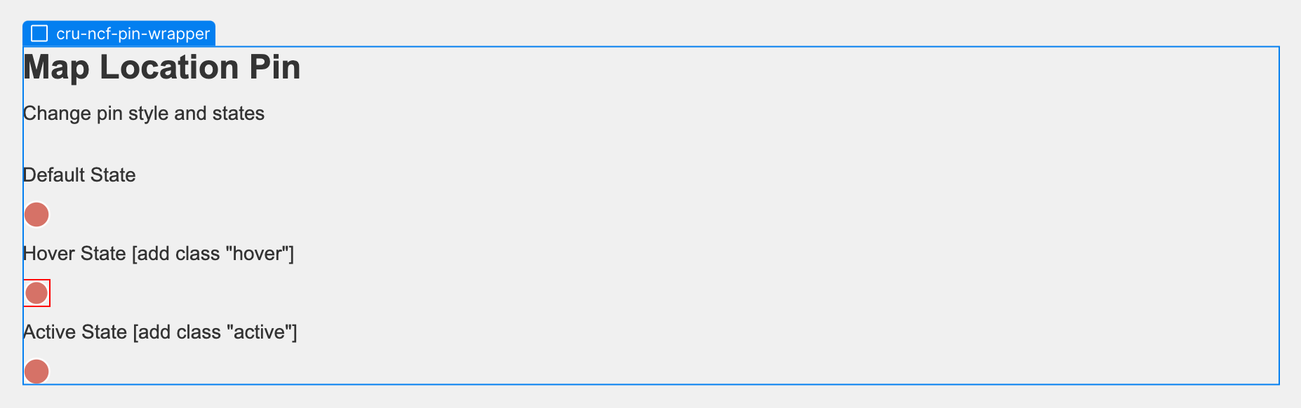
Style the pin's default state by styling the pin without additional style elements attached to it.
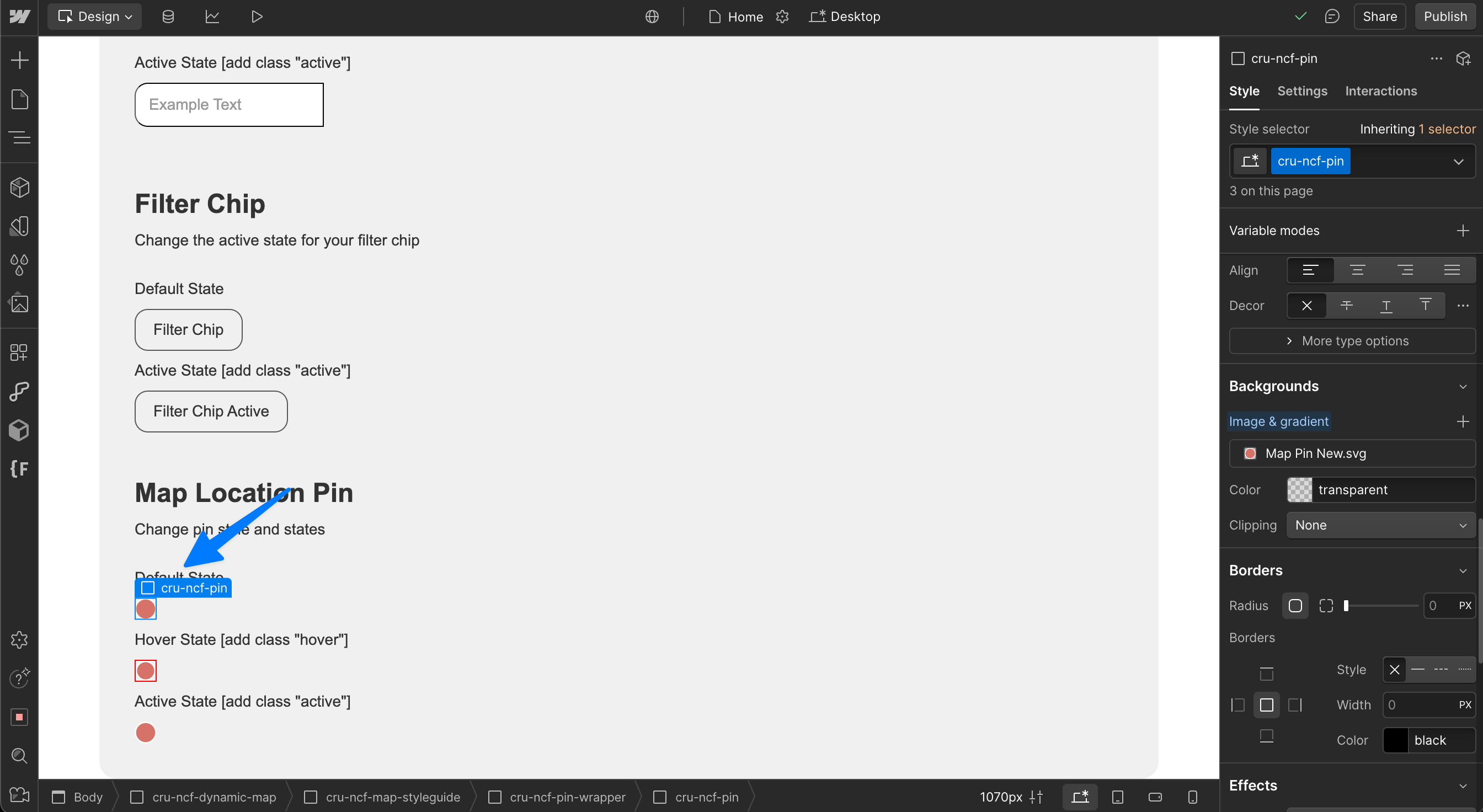
Style the pin's hover state by adding the class "hover" to create a combo class in Webflow.
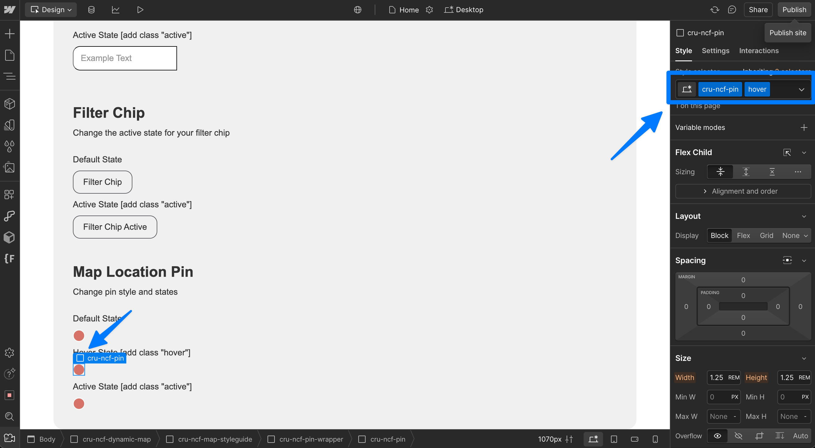
Add the state classes "hover" and "active" to your pin.
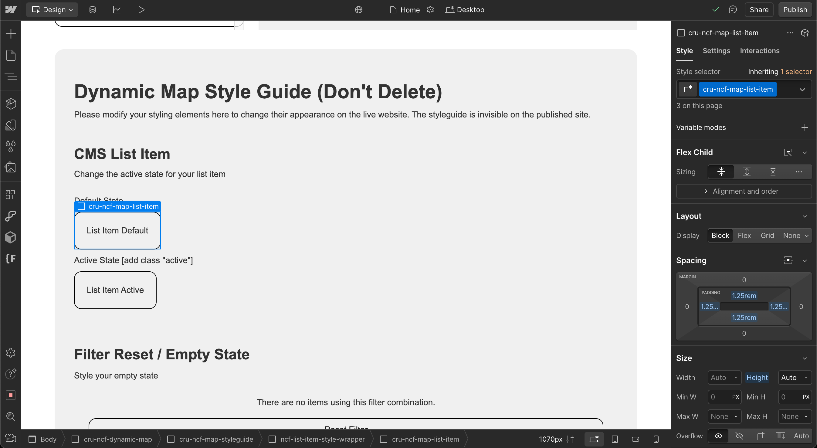
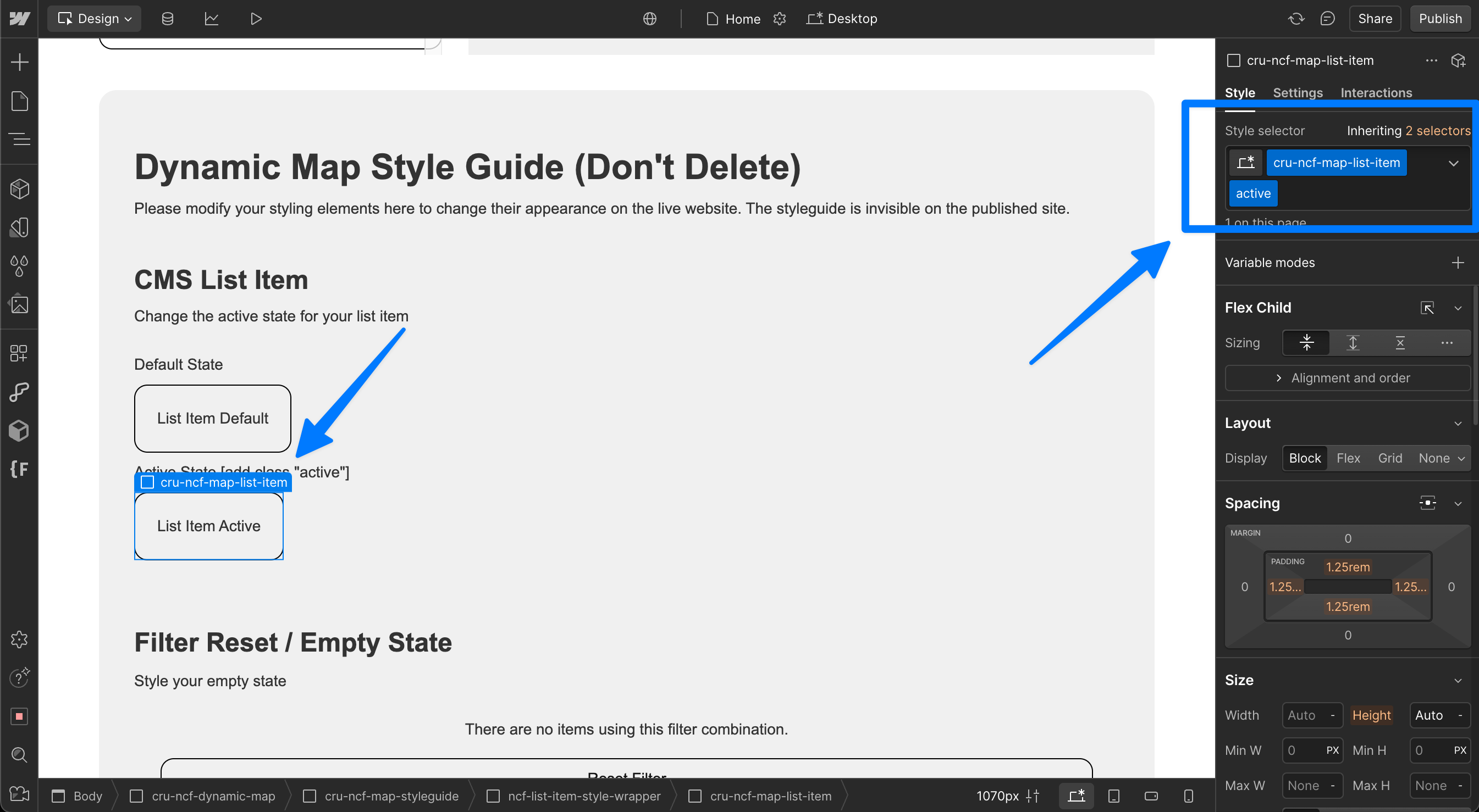
List Item States [Hover]
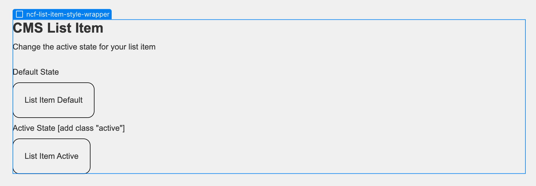
The list item state can be styled in Webflow Dynamic Map's Style Guide. This only affects the element's style, not its content.
Style the list item's default state by styling the list without additional style elements attached to it.
Style the list item's hover state by adding the class "hover" to create a combo class in Webflow.
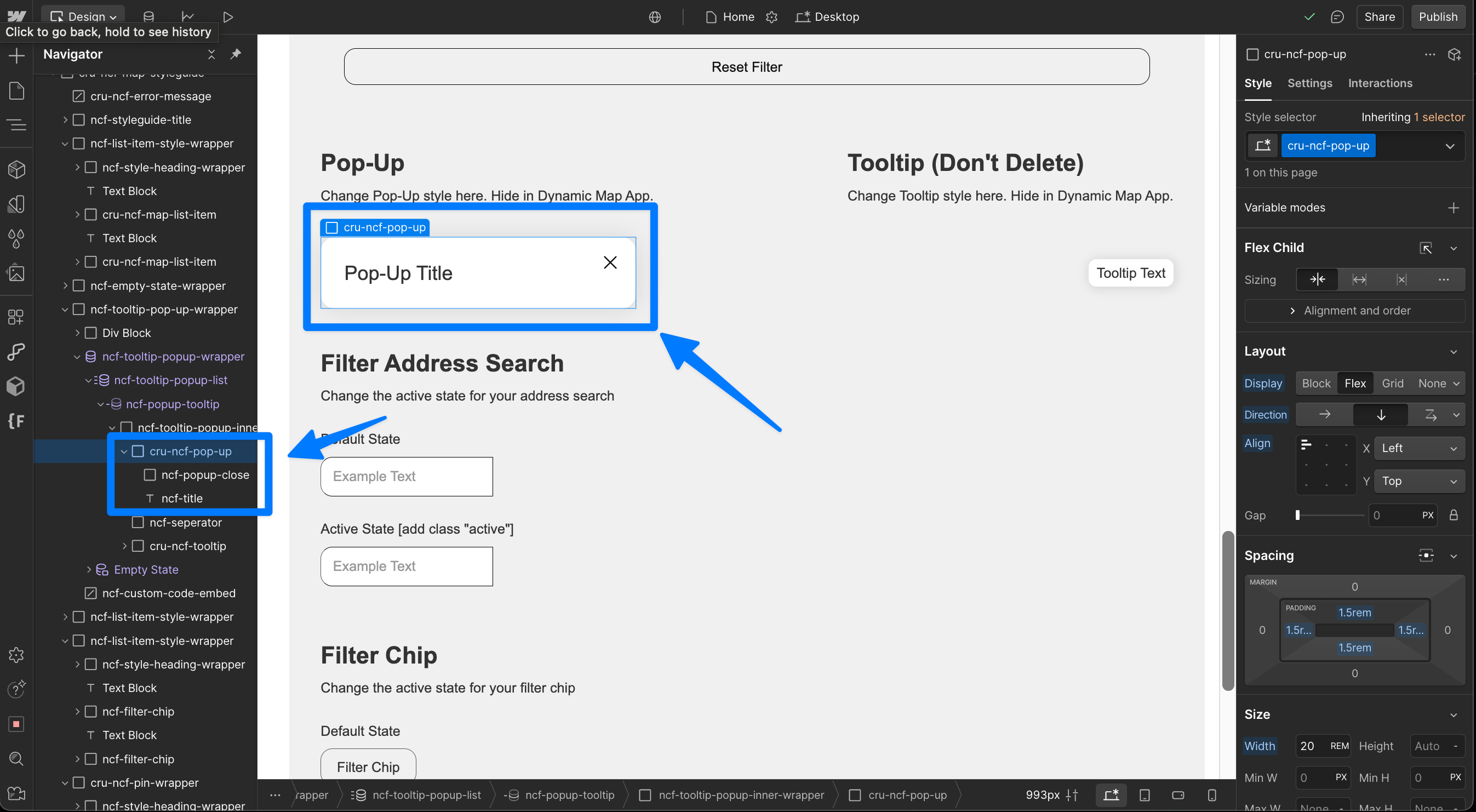
Style Pop-Up / Tooltip
Add Pop-Up and Tooltip via Map Interactions.
Style Pop-Up contents
Every element placed inside the cru-ncf-pop-up will be displayed in the pop-up on click.
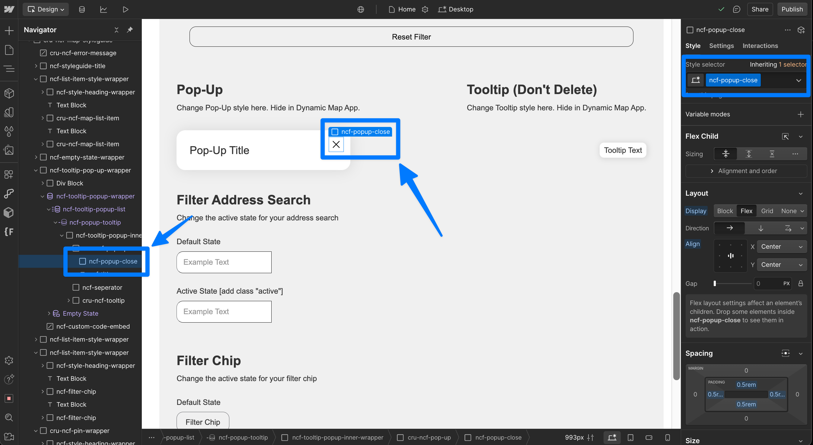
Style Pop-Up close button
Every element placed inside the cru-ncf-pop-up-close will work as a UI for the pop-up close button.
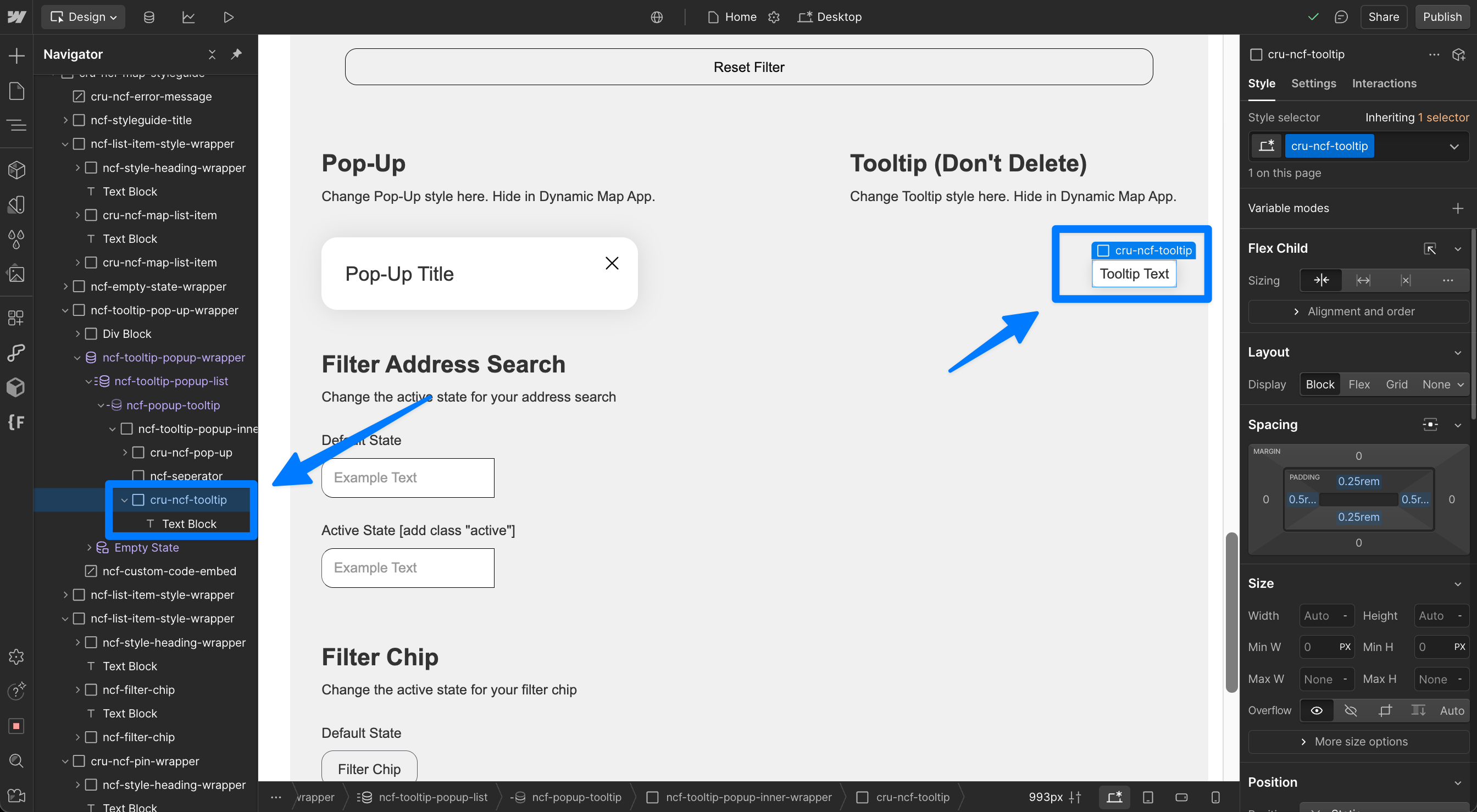
Style Tooltip contents
Every element placed inside the cru-ncf-tooltip will be displayed in the tooltip on hover.
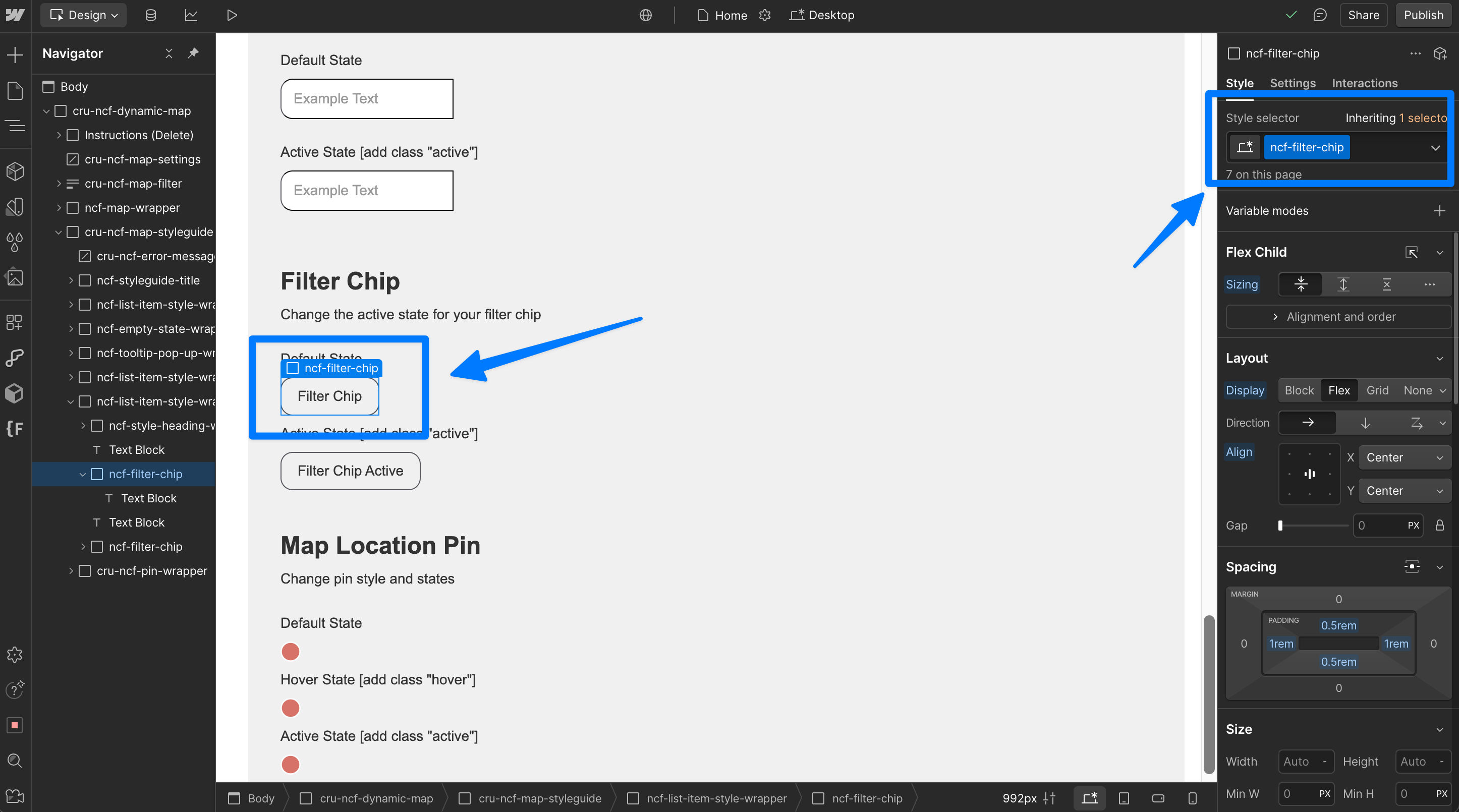
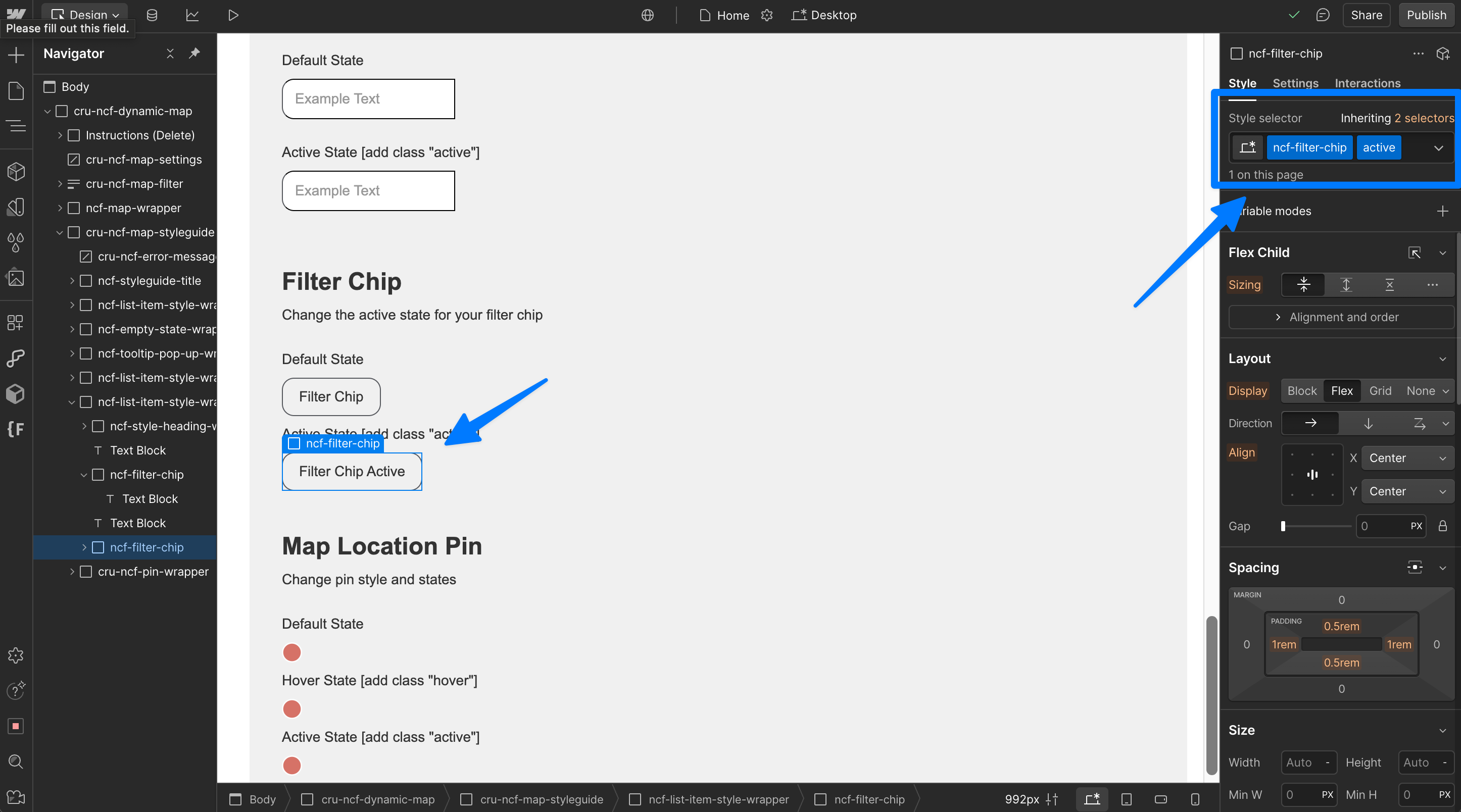
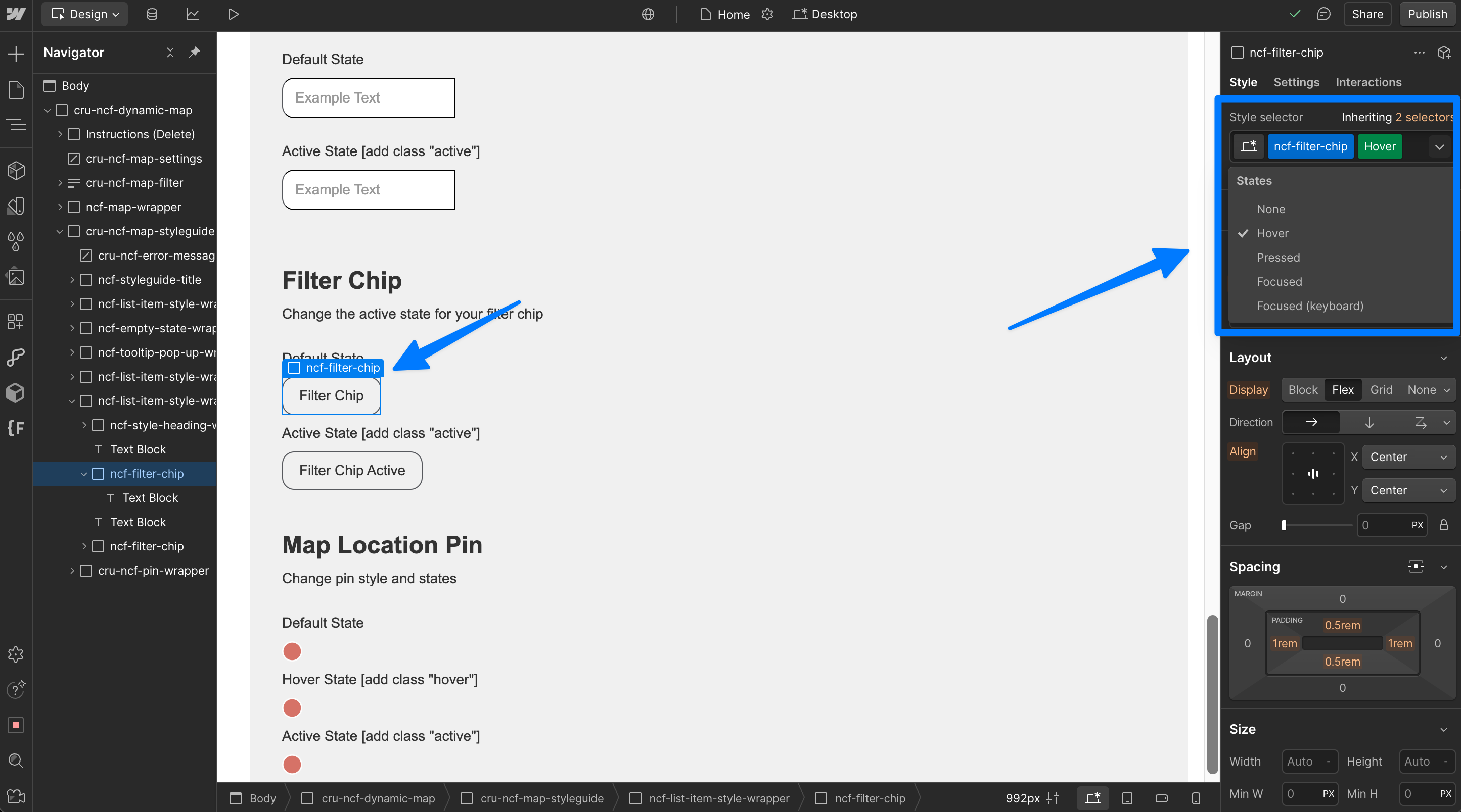
Filter Chips [Hover + Active]
Style the filter chip's default state by styling the filter chip without additional style elements attached to it.
Style the filter chip's active state by adding the class "active" to create a combo class in Webflow.
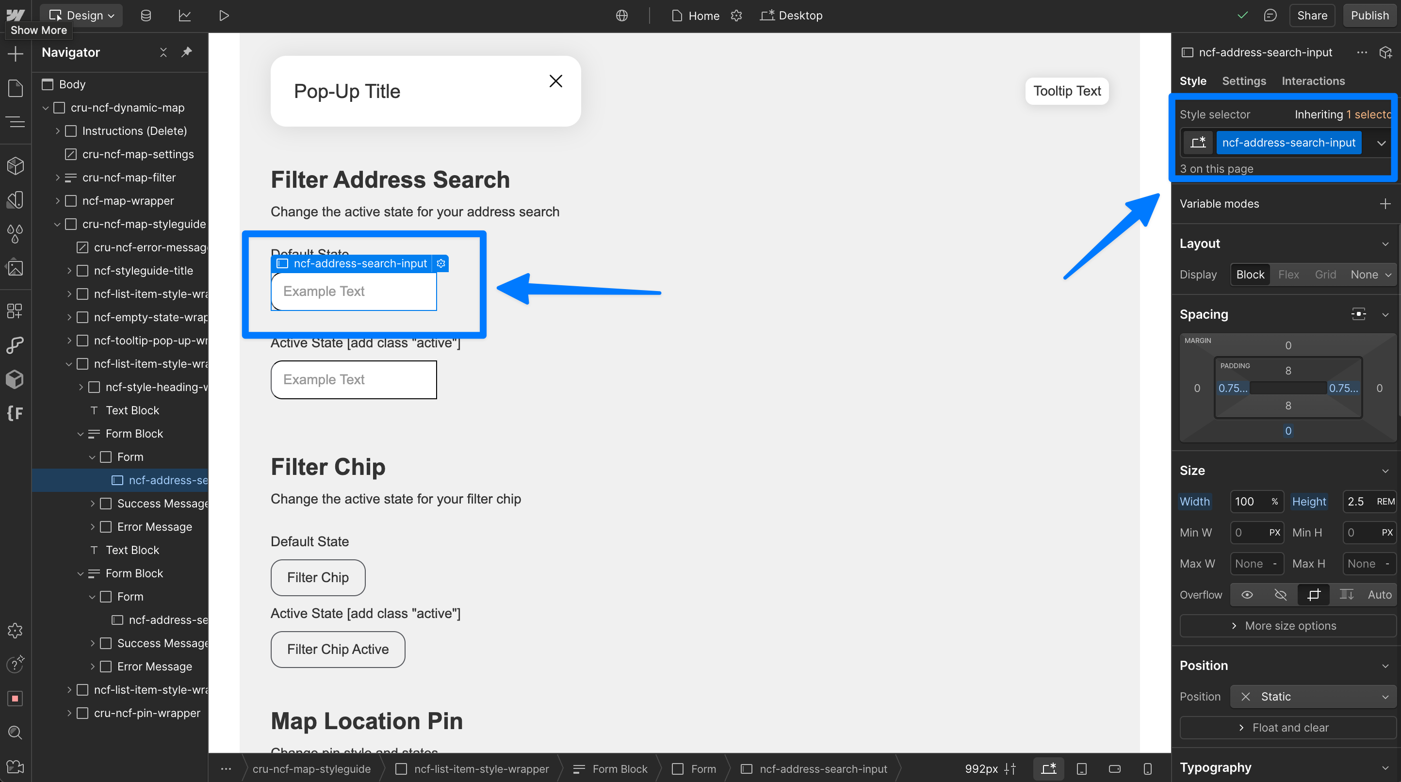
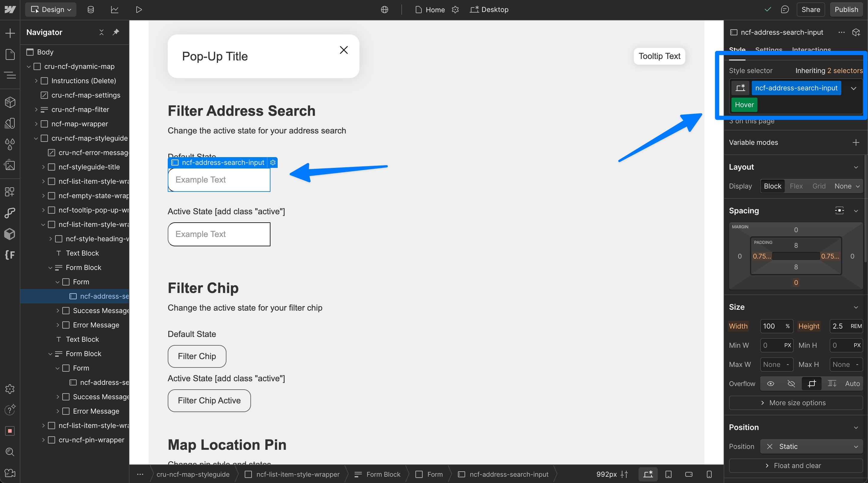
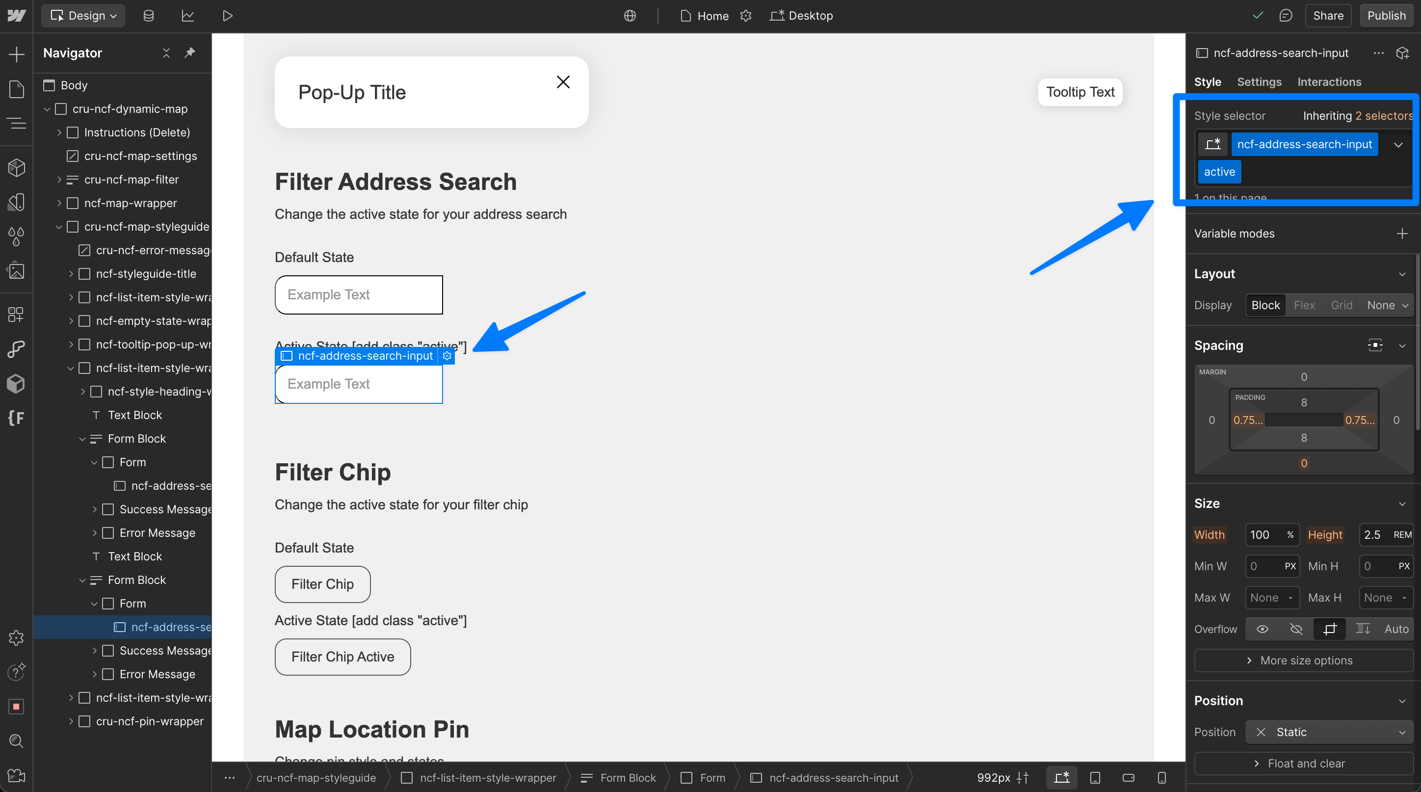
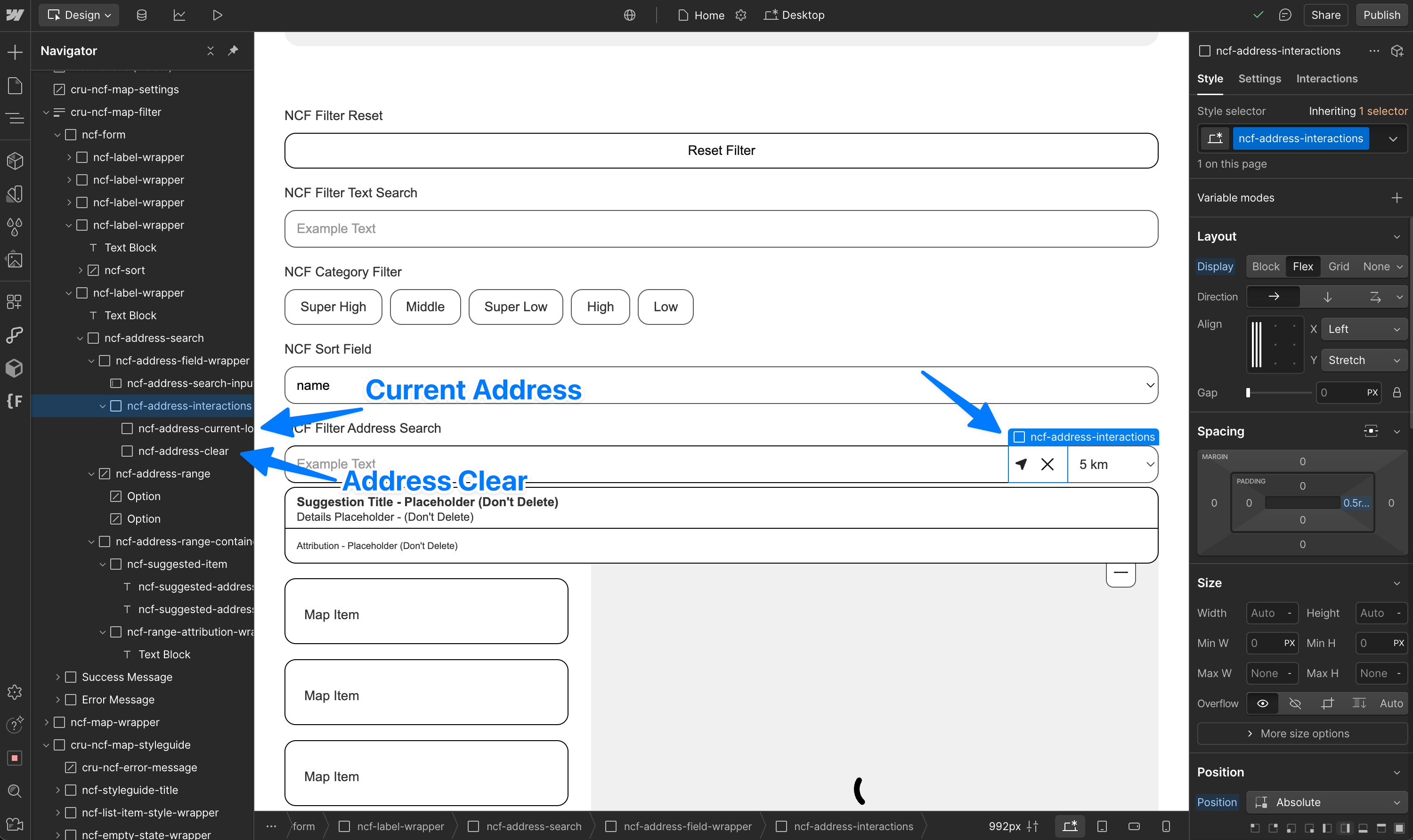
Address Search [Active]
Style Address Search states
Style the "active" state by having the address search active and adding "active" as a combo class to the element.
Style Address Search elements
You can style address search result items individually by selecting their elements in the Style Guide navigator.
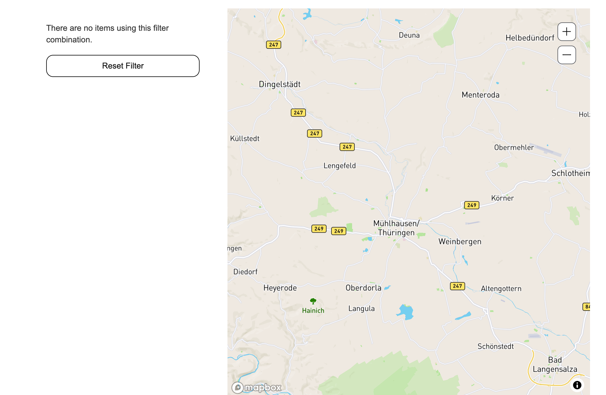
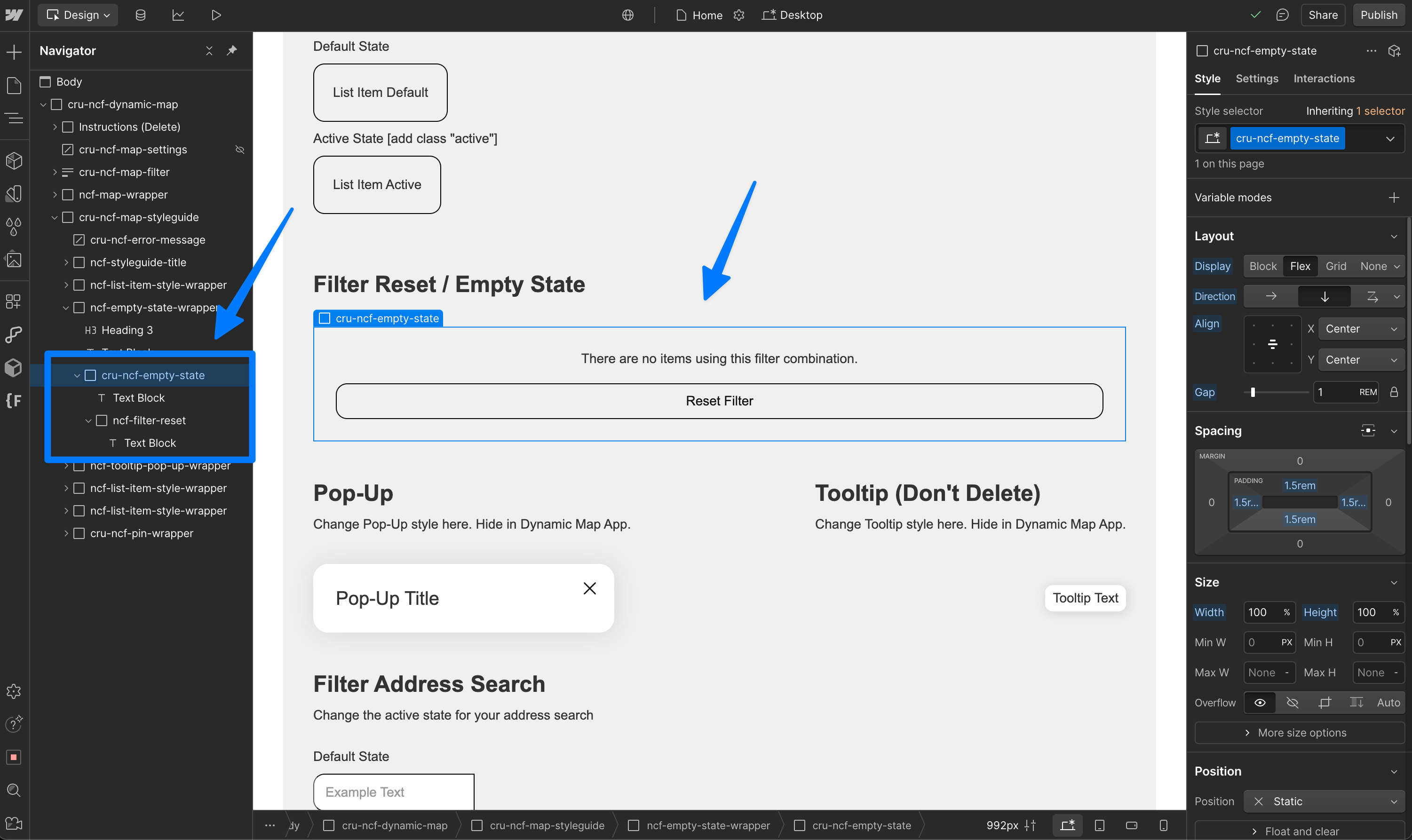
Filter Reset
The filter reset removes the active state and returns to the full map by resetting all filters.
Add the filter "reset" to easily and intuitively maintain a clean map experience for your users.
Custom / Individual Pin Style
💡 You can use Webflow custom code to assign classes to pins from the front of the CMS list. This way you can set individual styles which are more fulfilling.
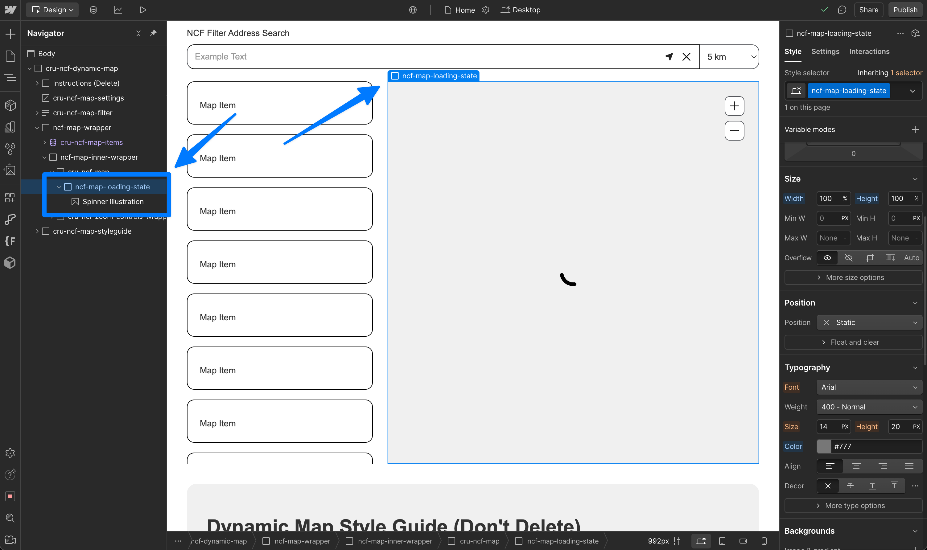
Map Loading State
💡 The loading state is determined in the Webflow editor. Make sure this element is visible on load.
Custom Map Style [Mapbox only]
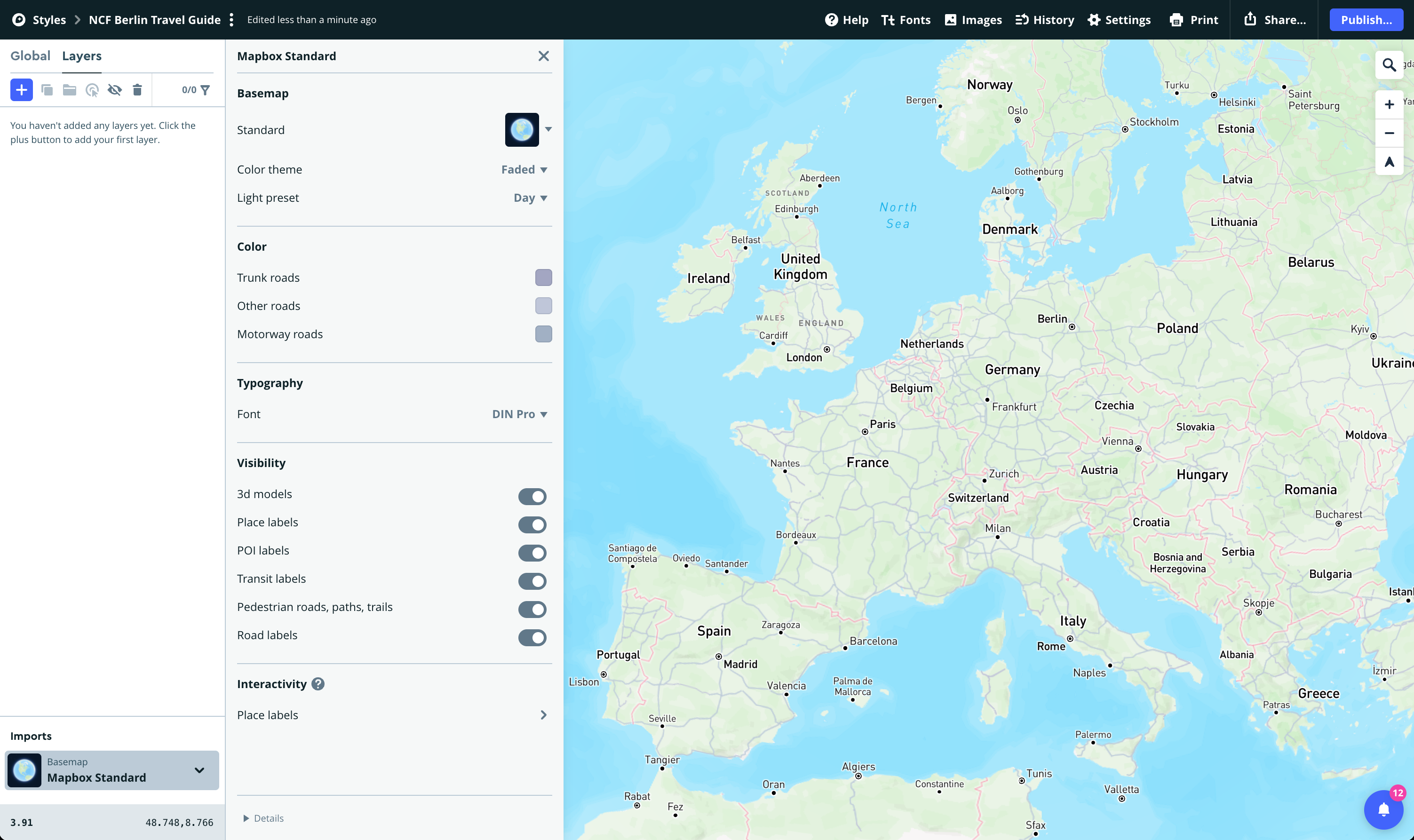
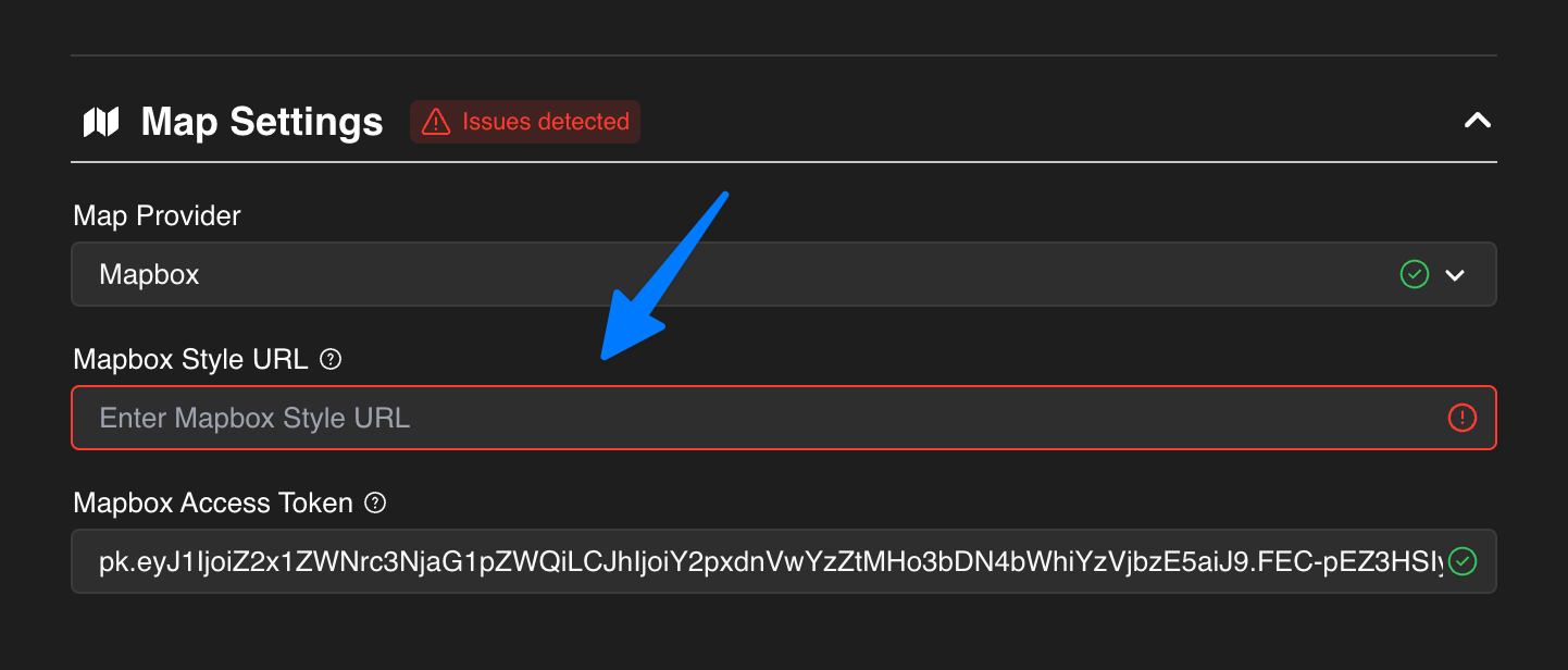
Navigate to your Mapbox Account → Styles → New Style to create a custom styled map. Then insert your Style URL into Dynamic Map App.