
Last updated:
May 28, 2026
Map Tooltip on Hover
Tooltips are lightweight overlays that appear when a user hovers over a map pin, giving them a quick preview of the location without requiring a click. Unlike pop-ups, which are designed for detailed content and require user intent to open, tooltips work passively. A user just moves their cursor across the map and information appears. They’re ideal for giving users a way to scan and explore the map before deciding which location to click for full details.
Tooltips are native Webflow elements, so they can contain any Webflow components: text, images, icons, CMS-bound fields, or anything else you’d style on the rest of your page.
Tooltips display brief information about a map item when the user hovers over its pin.
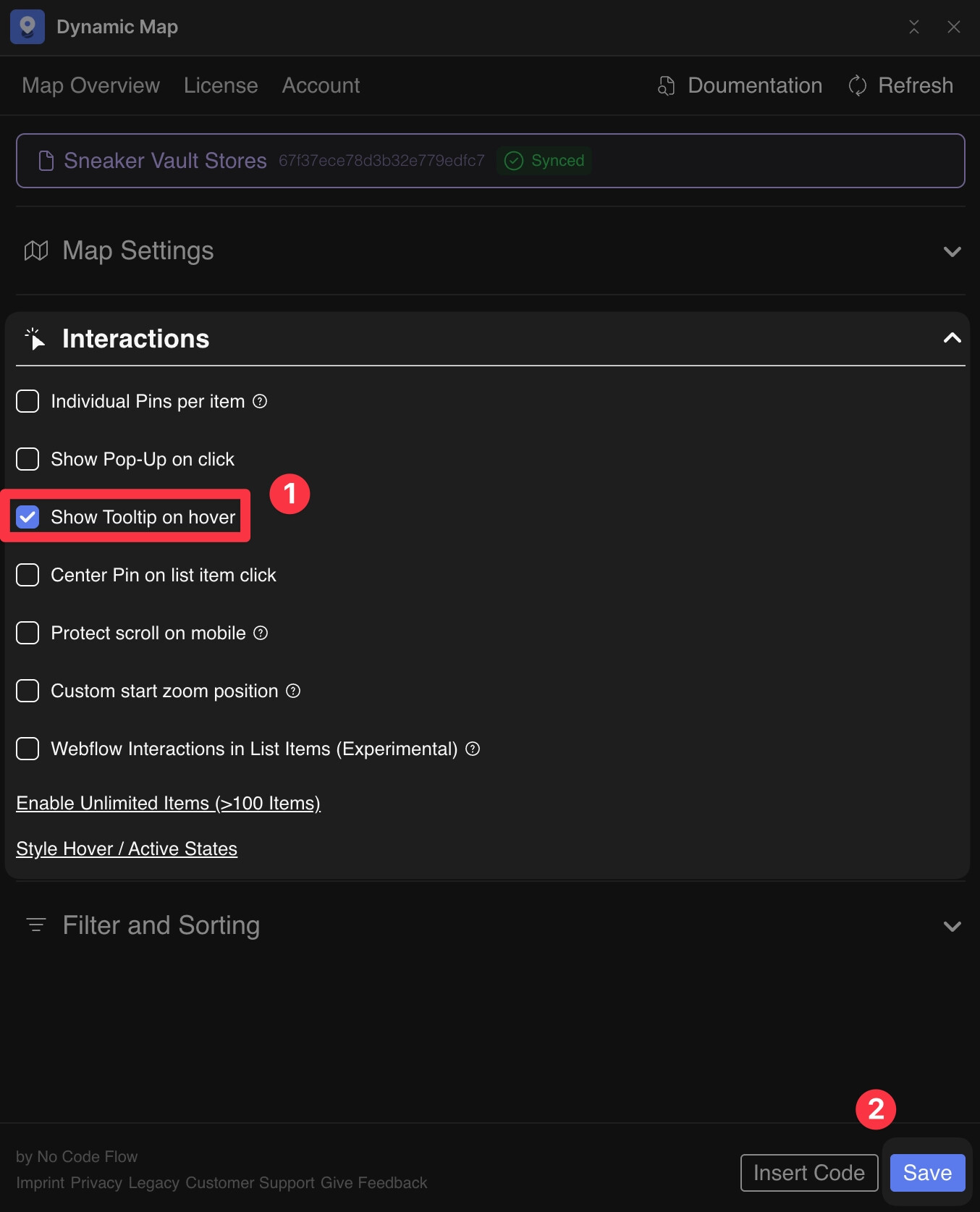
Enable in Dynamic Map App
- In Dynamic Map App, go to Map Interactions and activate Tooltip.
- Press Save.
Attributes
The div with ncf="maptooltipcontent" holds the tooltip content. Do not delete or duplicate this element.
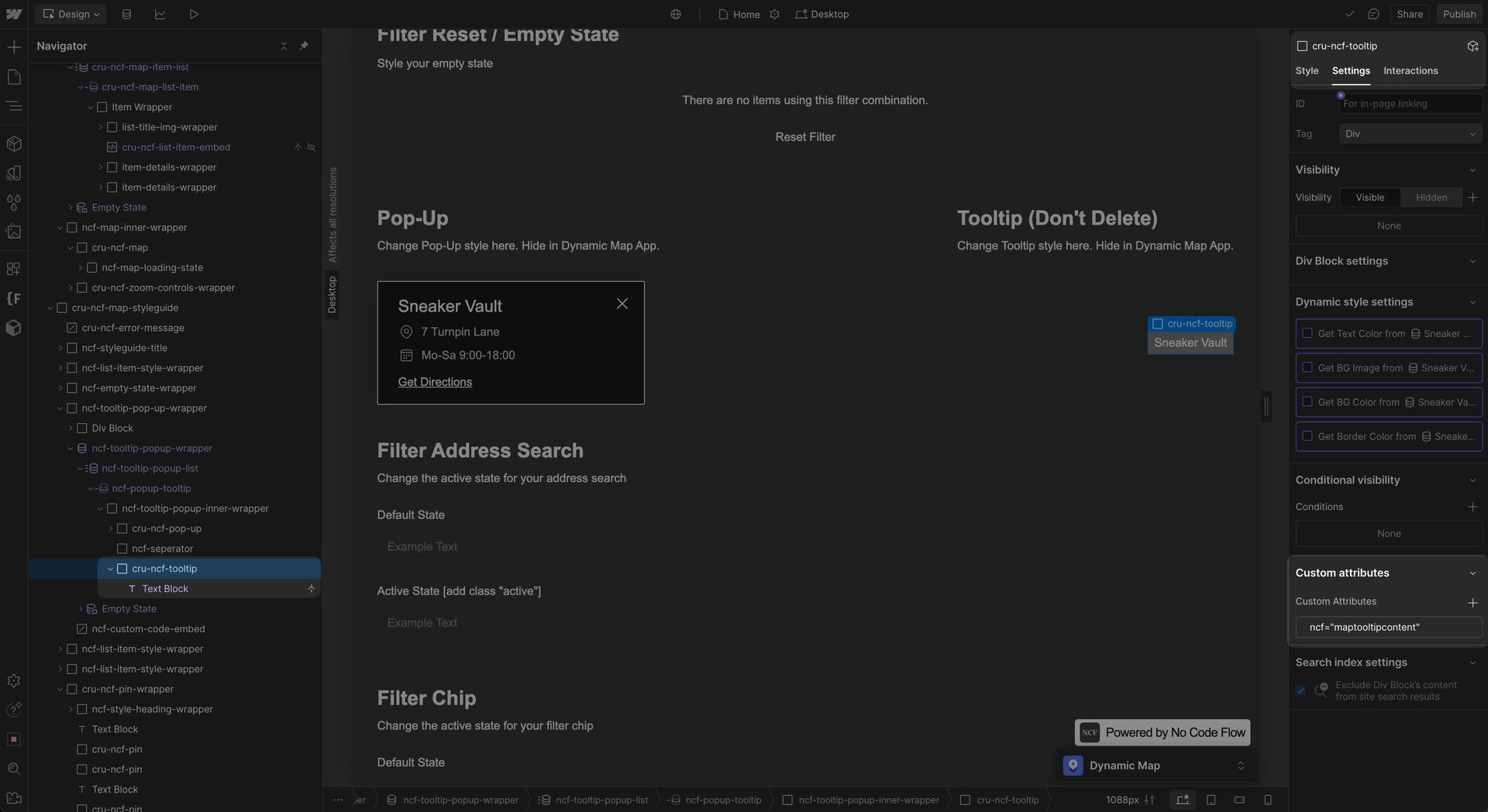
cru-ncf-tooltip with ncf=maptooltipcontent attribute.💡 Everything inside the tooltip can be styled directly in Webflow. For a click-based interaction, see Map Pop-Ups on Click.
Practical Tips
- Tooltips and pop-ups can be active at the same time. A common and effective pattern is using both: the tooltip gives a quick hover preview, and clicking the pin opens the full pop-up with detailed content and a CTA. Enable both in Dynamic Map App’s Interactions panel.
- Keep tooltip content to one or two fields. Tooltips are at their best when they’re brief, a name, a category, and one key detail. If users consistently need more than two lines of information on hover, a pop-up is the better fit.
- Don’t duplicate the cru-ncf-tooltip element. Like all structural Dynamic Map elements, cru-ncf-tooltip should exist once and only once per map. Style its child elements to customise the appearance, don’t copy or duplicate the wrapper itself.
Use Cases
- A restaurant guide where hovering shows the restaurant name and cuisine type before a user clicks for the full menu and booking link.
- A property map where hovering shows the price and number of bedrooms at a glance before clicking to see photos and the full listing.
- A travel guide where a quick hover reveals the attraction name and opening hours so users can plan without clicking every pin.
- A store locator where hovering shows store hours, reducing friction for users who just need to know if a location is currently open.